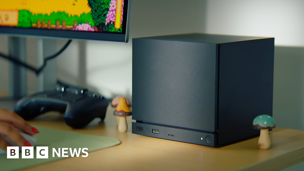
The new headset is called the Steam Frame, and it’s trying to do several things at once. It’s a standalone VR headset with a smartphone-caliber Arm chip inside that lets you play flat-screen Windows games locally off the onboard storage or a microSD card. But the Frame’s arguably bigger trick is that it can stream games directly to the headset, bypassing your unreliable home Wi-Fi by using a short-range, high-bandwidth wireless dongle that plugs into your gaming PC. And its new controllers are packed with all the buttons and inputs you need for both flat-screen games and VR games.
https://www.theverge.com/games/816118/valve-steam-frame-vr-headset-streaming-arm-steamos-hands-on


